Note
Go to the end to download the full example code. or to run this example in your browser via Binder
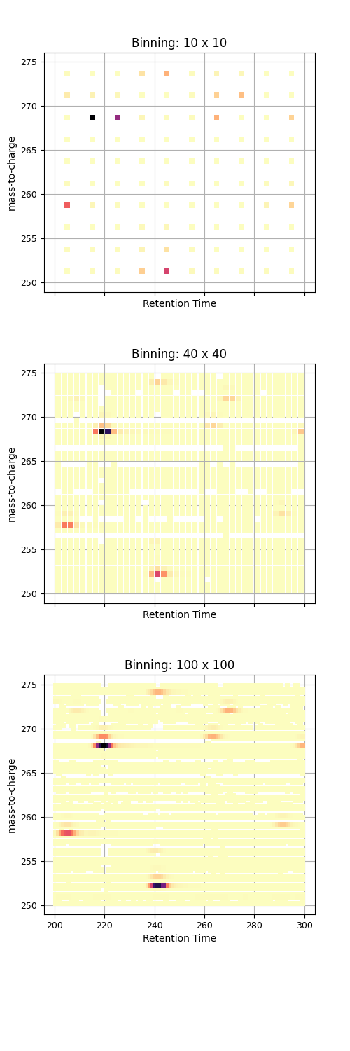
Plot Peakmap Binning Demonstration#
This example demonstrates how different binning levels affect peak map visualization
import pandas as pd
import requests
from io import StringIO
import numpy as np
import matplotlib.pyplot as plt

pd.options.plotting.backend = "ms_matplotlib"

url = "https://github.com/OpenMS/pyopenms_viz/releases/download/v0.1.5/TestMSExperimentDf.tsv"
response = requests.get(url)
response.raise_for_status()
df = pd.read_csv(StringIO(response.text), sep="\t")


fig, axs = plt.subplots(3, 1, figsize=(5, 15), sharex=True, sharey=True)


binning_levels = [(10, 10), (40, 40), (100, 100)]

for ax, (num_x_bins, num_y_bins) in zip(axs, binning_levels):

    df.plot(
        kind="peakmap",
        x="RT",
        y="mz",
        z="inty",
        aggregate_duplicates=True,
        num_x_bins=num_x_bins,
        num_y_bins=num_y_bins,
        canvas=ax,
        title=f"Binning: {num_x_bins} x {num_y_bins}",
        title_font_size=12,
        show_plot = False,
        xaxis_label_font_size=10,
        yaxis_label_font_size=10,
        xaxis_tick_font_size=9,
        yaxis_tick_font_size=9,
    )

fig.subplots_adjust(top=0.95, hspace=0.3, bottom=0.13)
plt.show()
Total running time of the script: (0 minutes 0.319 seconds)